As touched on in our other article, Using Custom Metrics in Google Analytics, if you have:
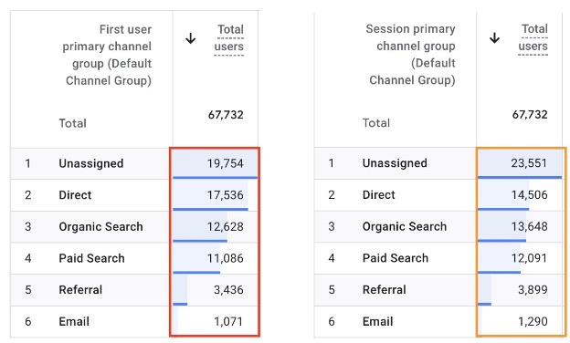
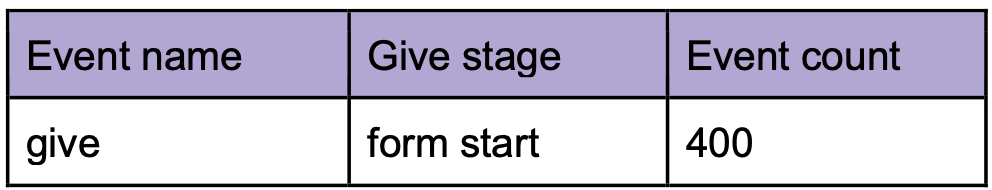
Data in different rows:
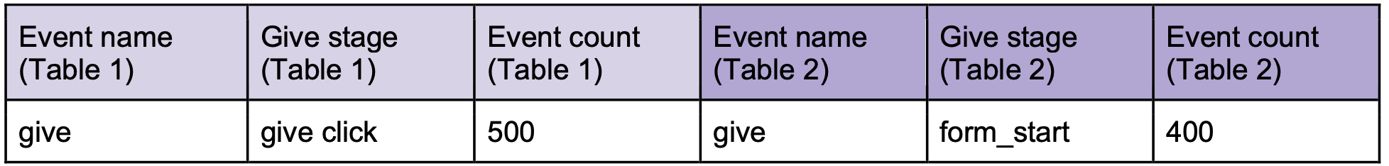
Or data in different tables entirely:
Table 1
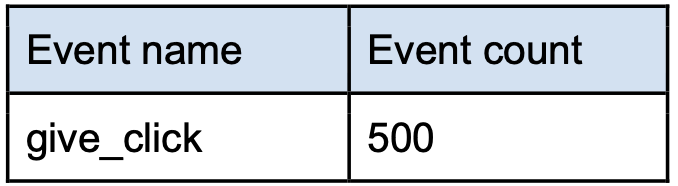
Table 2
And you need to combine them into the same rows, for example, to aggregate the numbers:
Without access to other solutions such as custom metrics, you will find that it's not straightforward to do so and it takes multiple steps.
In this article, we will show you how to do just that in Data Studio — using Data Blends to combine multiple rows/tables of data into the same rows for easier data aggregation and visualization.
Think of it this way - the concept is similar to how you would do it if you were to export the data to a spreadsheet, and then manipulate the data by moving the cell positions and adding spreadsheet formulas.
Essentially, what you want to achieve is:
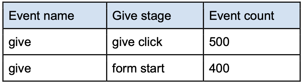
(1) From the source table:
(2) You want to extract the individual info that you need into individual intermediary tables:
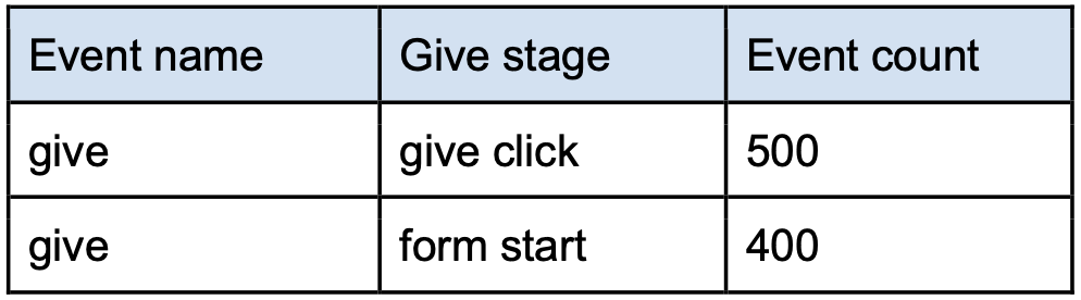
Table 1: Get Event count where Event name = give_click
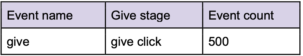
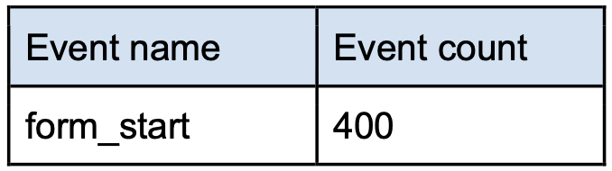
Table 2: Get Event count where Event name = form_start
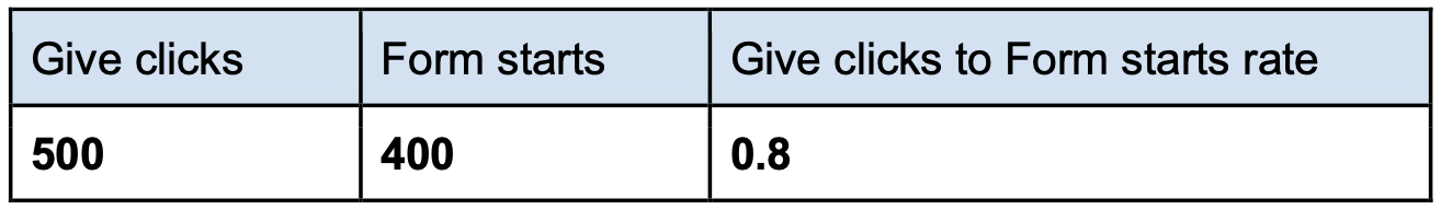
(3) Now that you have the two intermediary tables, you can blend them together into a new table, by using the Event name field as the join key (so that it knows "give" = "give" and puts them in the same row). The new table will consists of all the fields from the two tables:
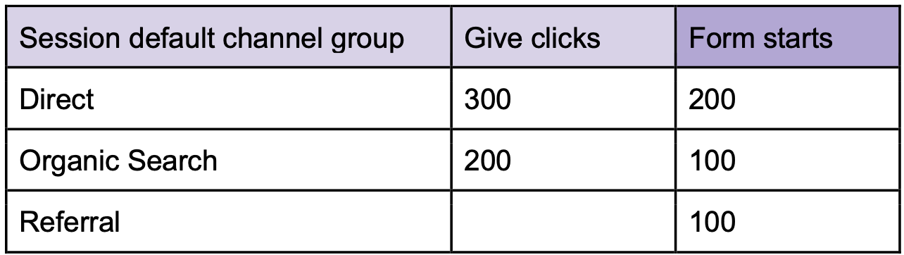
With this new table, you should find it much easier to do your data aggregation and visualization. For example, you can add a calculated field in Data Studio to easily display the completion rate. For example:

(We are going to use a different, slightly more complex example to illustrate some pitfalls you need to watch out for when doing data blends)
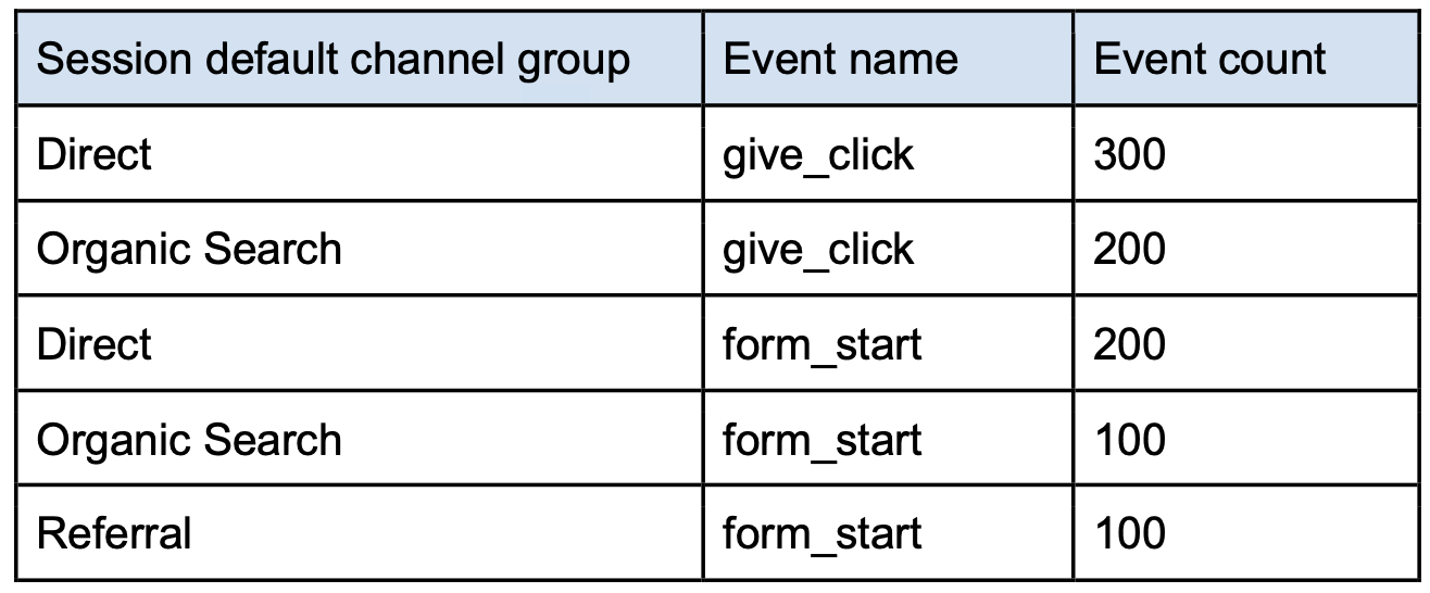
You have a source table like this:
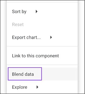
To use data blends in Data Studio, click this toolbar button:
Or this menu item:
Then click Add a Blend:
Keep in mind what is explained in the Key concept section of this article. In the next screen, this is the part where you can start to build the individual tables that you need.
Looking at the source table, for the first table we want all rows with Event name = give_click, so we do the following:
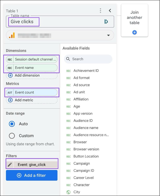
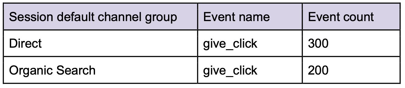
The resulting table will look like this:
Then you can build the second table by clicking this button:
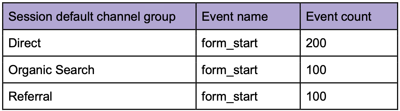
Then similarly, build the second table by doing the following:
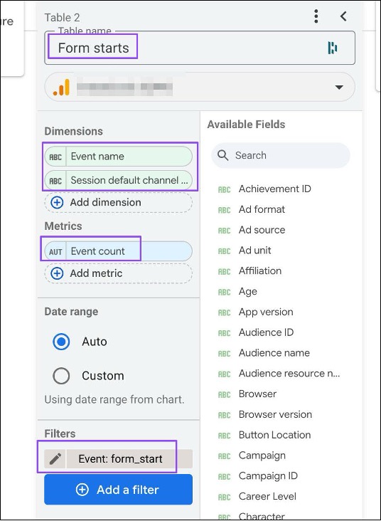
The resulting table will look like this:
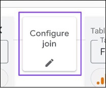
Next, click the join button again, which now has become Configure join:
Under the Merge conditions section, ensure that:
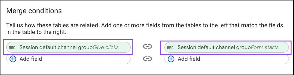
This tells Data Studio how to combine the different rows from the different tables to the same rows on the new blend table. In other words:
Then put them in the same rows in the new blend table.
Under the Merge operator section, you can see the table join methods:
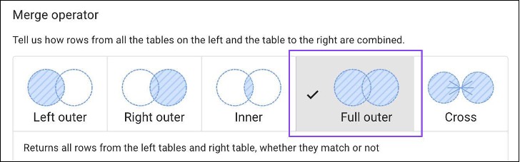
Which join methods you use will depend on your table structures and reporting needs. In our example, it's best to use the Full outer join method.
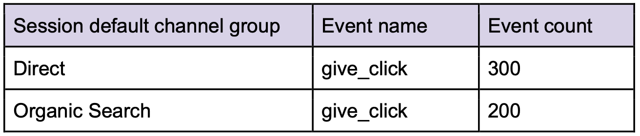
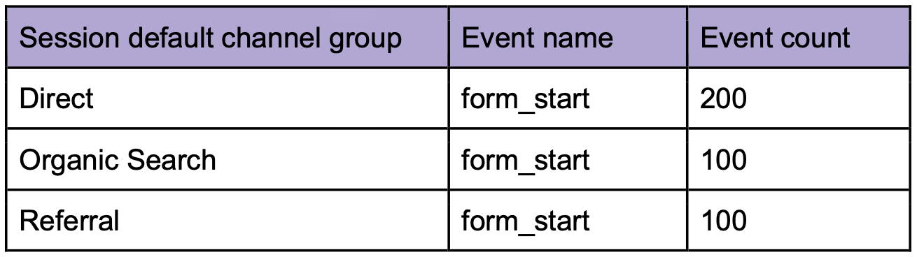
To help you to visualize, we have two intermediary tables:
Give clicks:
Form starts:
Explanation: Returns matching rows from the right table, plus non-matching rows from the left tables.
The blend table will look like this:
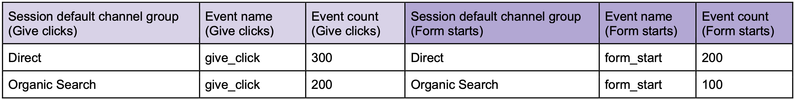
Explanation: Tell us how rows from all the tables on the left and the table to the right are combined.
This is the opposite of the above where the blend table will look like this:
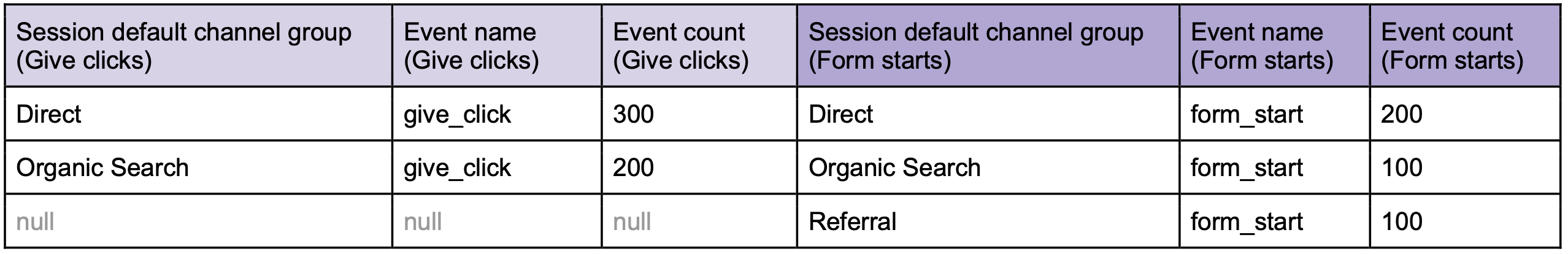
Explanation: Returns only matching rows from the left and right tables.
The blend table will look like this:
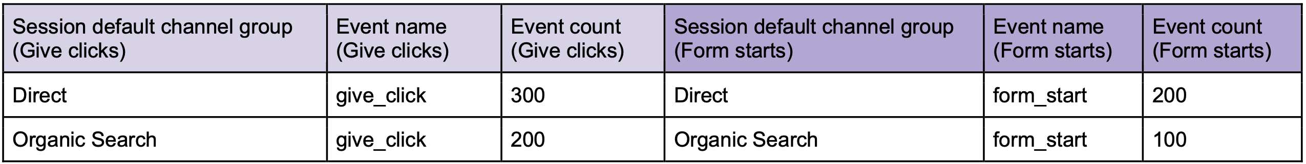
Explanation: Returns all rows from the left tables and right table, whether they match or not.
This is like combining Left out and Right outer joins. The blend table will look like this:
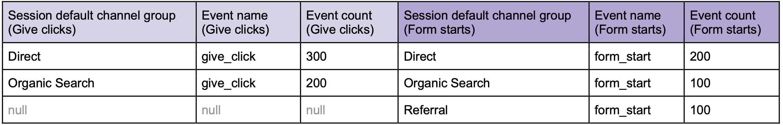
Explanation: Returns every possible combination of rows from the left and right tables.
This method doesn't allow you to specify the join keys. Data Studio will attempt to automatically join the tables using all the fields available. Typically we do not recommend using this method. It's better for you to tell Data Studio exactly how you want to join the tables.
With intermediary tables created and the join conditions settled, the last step is to give you new blend table an easy-to-remember name:
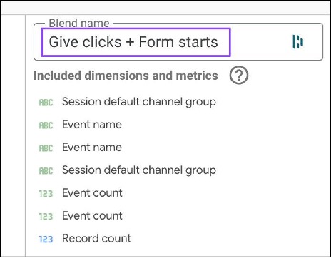
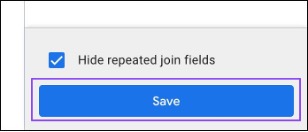
And save your blend:
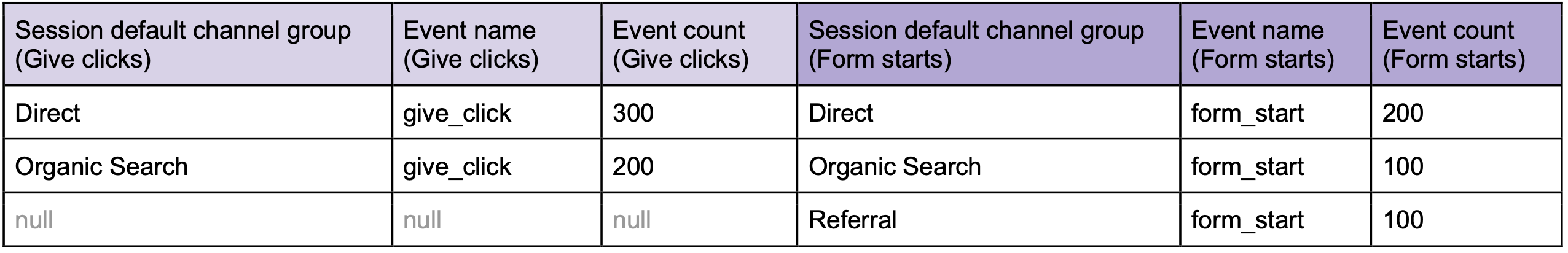
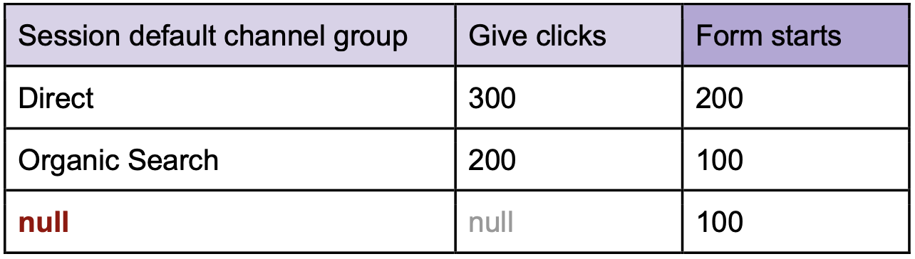
So now you have a new blend table with this data:
It's time for you to display it in this table format:
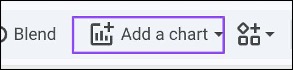
You can add a chart by clicking this toolbar button:
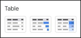
Then choose any of the table styles to start with:
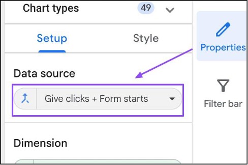
At the chart properties section, ensure to select your new blend table as the data source:
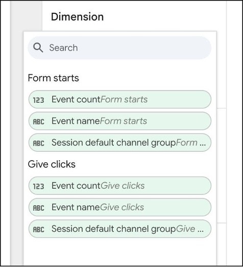
When adding dimensions or metrics to your chart, it is important to remember that ALL the fields from the intermediary tables are added to the blend table:
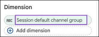
To display Session default channel group, you can pick from one of the tables, but we recommend always picking the left-most table. You can add these to your chart:
When you do that, you may see a chart like this:
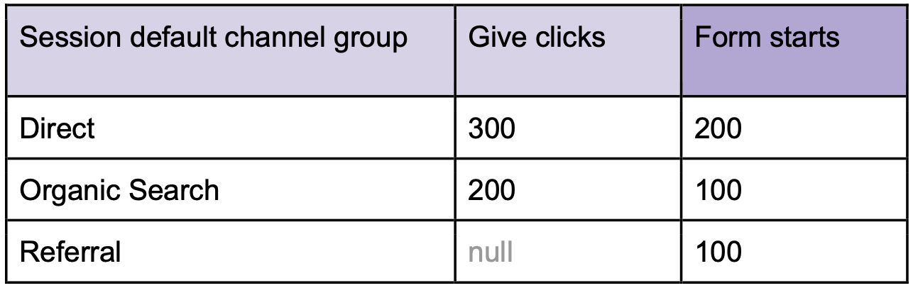
This is where most people get confused and wonder about the incorrect string values or the aggregated metrics.
But if you look at the blend table data, it's easy to understand why:
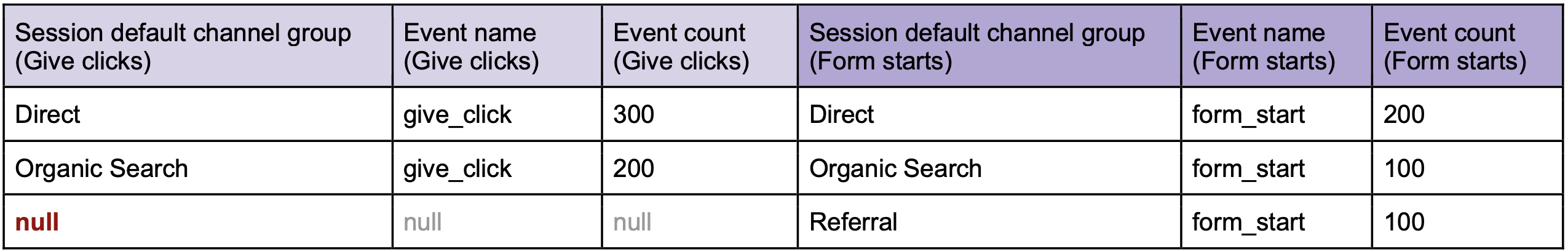
We are choosing to display Session default channel group from the left-most table, so of course the value will be empty.
To resolve this, what you want to do is use the COALESCE function to display the first non-empty field from the blend table, from left to right.
Click here to change the dimension:
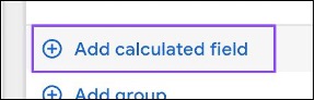
Then click the Add calculated field button:
In the next section, you can do the following:
COALESCE (Session default channel group (Give clicks), Session default channel group (Form starts))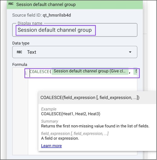
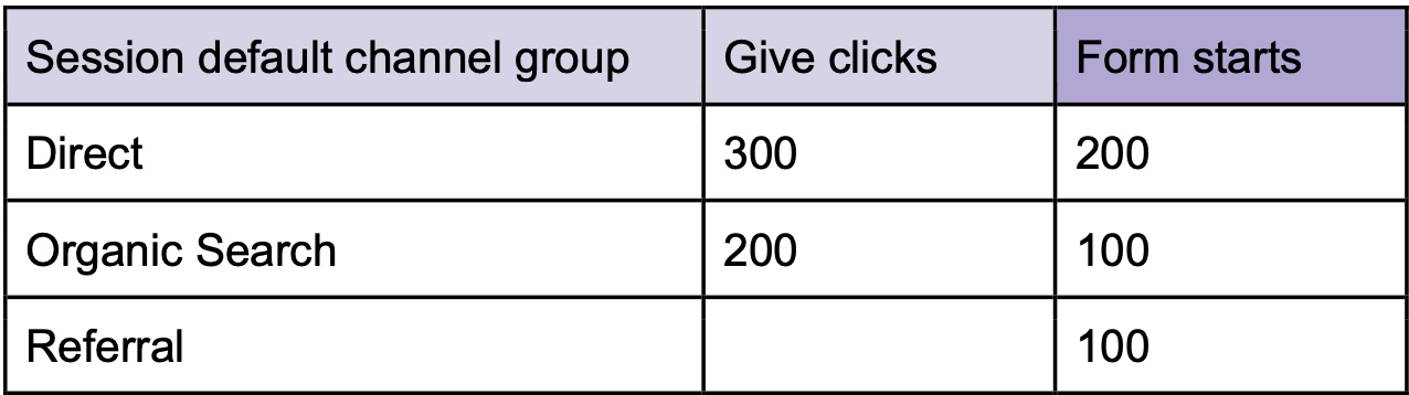
Your table chart should now look like this:
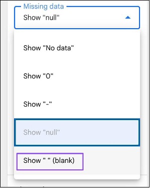
In the chart style options, you can change how empty values are displayed:
Giving a cleaner look:
If your intermediary tables are already displayed on your dashboard, you can use a shortcut to create the blend table:
However, we recommend building the blend manually so that you have full control over the dimensions and metrics that you need for the intermediary tables, without excess.